I’m faced with a design challenge everyday. Sweet! I like it. It’s fun and rewarding to find a solution, if that’s your thing. Like working on a puzzle: finding all the pieces, recognizing what’s their right position, joining them one by one, and finalizing with a composition that only makes sense when everything is together.
That being said, the pieces of the puzzle don’t have a clear shape or color, and a lot is left to analysis, and interpretation. And you don’t even have a reference of how the puzzle is supposed to look like.
Probably is not like putting a puzzle together at all. Whatever. Never mind.
Zie zombies
And who is the target? Who is going to end up looking at that puzzle — or whatever that is — that a UXUI Designer put together? You are. We are. The idle minded. Because that’s what we — the users — are in the end. Our brains are too busy thinking on what we’re going to have for dinner, where, with who, or if we will have take away on our own again. So when we grab the phone, open the browser, grab the TV remote, we’re not actively thinking. Content. That’s what we want.
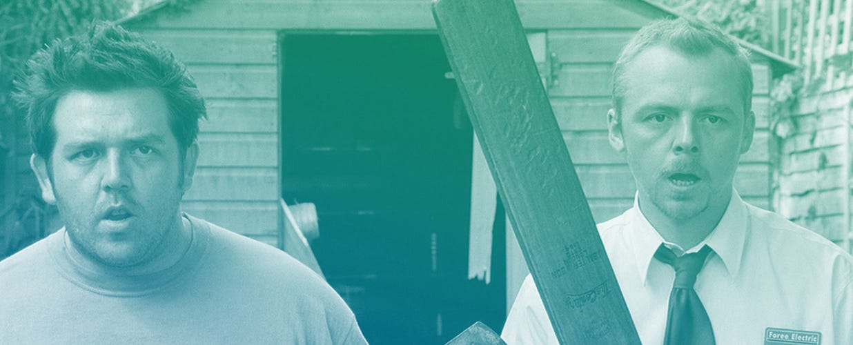
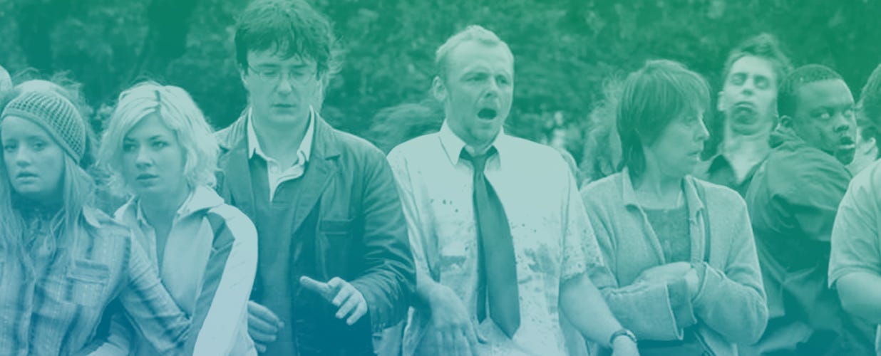
When I first heard about this, the fact that users don’t think, I felt disappointed on human intelligence. But after all, one of the must-read books for product designers is called “Don’t make me think”. Like it or not. We are contributing to feed a whole generation of Zombies. Users are zombies.
If you think about it, makes a lot of sense.
They move in big groups, without a clear objective, relying on automatisms and muscular memory, reacting slowly, and paying little or no attention to their surroundings.
Full attention, not necessary
Now, I am not saying that people are zombies. My point is that users are multitasking most of the time they spend in front of their devices. We eat sandwiches, drink coffee, walk around the city, talk to our friends, and listen to music. We even dare to think of more important stuff! Because using an app shouldn’t be cumbersome. After all it’s just a tool. The meanings to an end. And although some tools are far more complicated than others, once we learn to use them we don’t actively read any buttons or labels anymore. We knowwhere everything is. And when something changes we hate it, because it makes us think and reroute our wirings.

When I started designing websites, which would lead to designing software and interfaces, nobody told me psychology would play such a big role. Yet, we don’t get to play with full functioning brains most of the time, we have to make what we can out of 20% of the user’s attention — Yes, I made that number up.
Your users won’t be reading half of the labels, nor what the buttons say. They will type in what they consider that should be typed in, wherever they consider its supposed to be. And they will click that big chunk of color that looks like a button, and will always click and tap on the image, not the text. To make that easy, the design has to avoid possible distractions.
In order to make a user interface work, we have to strip it out of all the unnecessary. Here’s an example.
Keeping it simple, visually
A while ago, I work on a project at Asana. We called it Typography Update. During the redesign many hands touched the interface, and many engineers worked on the CSS. The result was great. But part of the collateral damage of having so many moving parts were little mismatches on font sizes, colors, and spacing.
So I went on and reduced the number of styles, fixed inconsistencies, and adjusted the margins. I reduced and standardize the body size, the paragraphs, and their line-height. Headings had the same exact style now, in a couple of different sizes for hierarchy. Project names became tokens almost everywhere. Margins became consistent around the objects, and relative to object their size. And different shades of gray for copy were reduced to only two, based on the contrast ratio with the background.

When I showed the first results to the product manager she couldn’t see the actual changes. She asked “How did you do that? You didn’t change anything and it looks way better!”. The multiple styles and little inconsistencies had been adding noise and clutter. Imperceptible. Little by little. Too many instruments going for a solo at the same time. We were making the brain work overtime, and forcing it to think. Not a lot. But more than what was necessary.
The voices in our heads
Why was this design more effective and harmonious?
Each different style is a new voice you add to the chorus that is the interface. Restricting the number of those will make things easier to process for the user, since they won’t have to register yet another voice in their head. A bunch of small disruptions will cause havoc in their visual field. But restrict it too much, and all the voices will be the same.
My advice then? When adding styles, make them dramatically different. Go from 10 to 14, from blue to black, from regular to bold. It either is really different, or it’s the same. Because zombies can tell a human from a deer apart. But all human are the same to them: just food.
We are idle minded, our list of priorities is to get what we want, not to understand how we are getting it. We are — and want to keep being — idle minded.
So when building a tool, design something that a zombie could use. That is good product design.