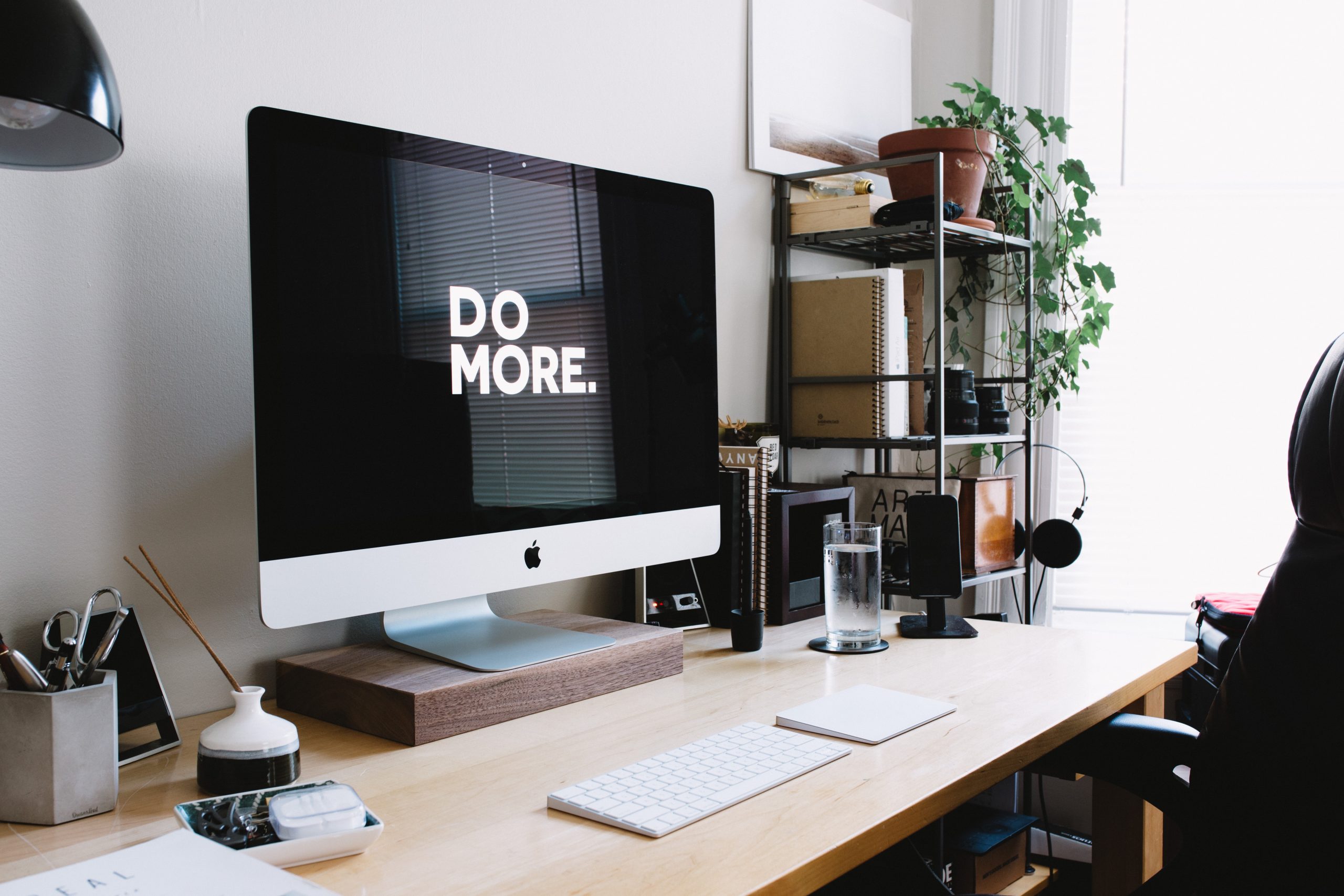
There are a lot of factors that can affect your productivity. Even the smallest details can become a mental obstacle without having it in mind! Colors, for one, change the way you feel about something. The impact color has is quite considerable, especially at the level of our brain and our emotions. Colors and productivity and linked, and learning how to use them to your advantage is a great way to improve efficiency. Another thing that is key to keep in mind, is that culture also affects the way you understand the world- and colors!
In a working environment, it is important to be as efficient as possible. The goal is to end up enjoying what you do to be more efficient! Having a sense of accomplishment is a key characteristic of humans, and many tools exist to help get there. Several studies show the impact that colors have on many aspects of our lives. For example, the choice of a laundry detergent or a garment.
Colors have symbolic values
Since colors and productivity are connected, it is important to understand their symbolic values. They affect our unconscious, our choices, and sometimes even our actions. For example, you will put twice as many ice cubes in a Coke as in a Pepsi because it will look warmer because of its red color, which reflects the heat.
Red
According to a study conducted by Dr. Nancy Kwallek, Professor of Indoor Environment at the University of Texas, employees working in red environments were more efficient and productive than those working in blue or white environments. This color is normally associated with leaders and power, it makes us feel stronger, and it embodies efficiency and aggressiveness. If you want to be efficient and productive, it is best to work in an environment containing shades of red. Nonetheless, it does not mean exaggerating the use of red; being in a red room is not the point.
Blue
On the other hand, a study conducted by Dr. Stephanie Lichtenfeld of the University of Munich found that participants working in a blue environment had greater creative thinking ability than those working in a red environment. Blue is a color that stimulates creativity. It is often associated with serenity and calmness, but it can also be used to encourage innovation. If you need to focus on creative tasks, working in an environment with shades of blue can be beneficial, or using blue elements like writing in a blue-tinted pen.
Yellow
It is a bright and cheerful color, which can stimulate mood and energy. A study conducted by the University of Stuttgart found that participants working in a yellow environment were more alert and attentive than those working in a white atmosphere. However, too much yellow can be exhausting for the eyes, so just having a yellow ambiance is more than enough!
Green
If you want to focus for a long time, the color green will be your ally. In fact, green helps to concentrate, which is why people tend to love reading on public benches. It is a color associated with calm and serenity. A fun fact is that green is the color from which our eyes perceive the most shades.
White
Finally, white is often associated with cleanliness, purity, and simplicity. It is an ideal color to create a clean and minimalist workspace. However, mixing it with other colors can make it less striking to the eye; use color accents to break the monotony.
As said before, colors and productivity are linked! It is important to choose colors that correspond to the ambiance you are looking for. If you want to be effective and productive, shades of red can be beneficial. If you want to boost your creativity, blue is a good option. Do not feel overwhelmed, just a hint of colors can work magic. You can even try using colored pens and see how they work. In short, there are as many choices as there are colors!
At Itnig Spaces, the colors are implemented to stimulate every brain! The walls have a warm green which helps with concentration. It is also associated with calmness which is needed in a coworking space! In the Flexroom the predominant color is white. It is highlighted with yellow-toned stones which stimulate mood and energy. The colors of our areas were thought to each and all of our clients a comfortable space that, at the same time, stimulates their minds. We are eager to push your creativeness to achieve great things with Itnig Spaces.