Barcelona Startup Ecosystem
Barcelona is known by many for its association with Gaudi, Picasso and many other outstanding thinkers, artists and architects. Today, when we think about Barcelona, we think about the entrepreneurial spirit going on in the city, the drive for innovation and the incredible Tech and Startup ecosystem it has to offer.
The legend states that Hercules fell in love with the area and decided to found a new city with the support of Hermes, the god of arts and trade. Together, they founded Barcinno. Across history, this small Roman Colony grew into one of Mediterranea’s strategical commerce and international trade sweet-spot.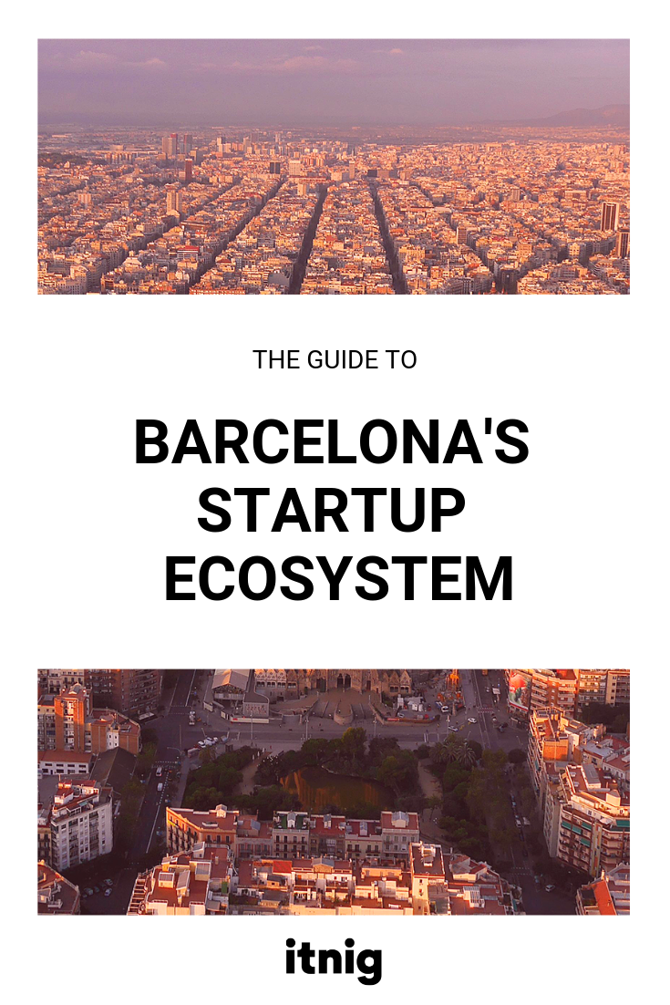
Content Table:
- The Ecosystem in a Few points.
- How’s life in Barcelona?
- Life cost in Barcelona
- The Access to outstanding workspaces
- Building your Startup team in Barcelona
- Talent Development Programs
- Hackathons and Challenges
- What are the leading sectors in Barcelona?
- Startup Incubators and Accelerators of Barcelona
- The Investment within Barcelona’s Ecosystem
- Seed Funds and Business Angels
- Other venture capital of the City
- Business and Tech events in Barcelona
- Tech innovation in Barcelona
- Build your network
This startup hub attracts talent from all around the world and is home to more than 1,300 startups. The ecosystem value has increased up to $6.4 billion dollars.
Now, you might ask yourself: ‘Why Barcelona?’
This city offers many opportunities. With an ecosystem that is under constant evolution, Barcelona makes a competitive environment and a great hub in a strategic location. It’s one of Europe’s most dynamic and engaging ecosystem, especially in industries like digital technologies, big data, and tourism.
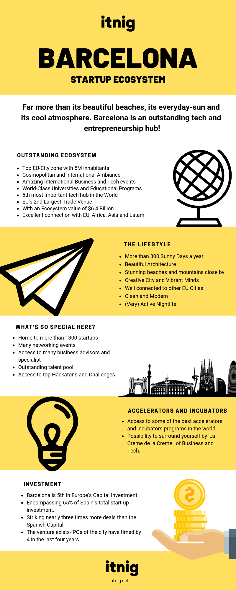
The Ecosystem in a few key points
- Barcelona is a top EU City with 5M inhabitants
- ‘’E-Capital of Europe in 2016’’ (EU Commission Prize)
- Catalunya’s University System recognised as 3rd best in the world.
- According to Mobile World Capital, Barcelona is home to 34% of Spain’s Startups, representing the World’s 3rd most attractive city for founders.
- 5th most important World Tech Hub (according to the Mobile World Congress)
- 86% of people believe that Barcelona will soon become the World’s next best Startup Ecosystem (survey of the Mobile World Congress)
- The City offers the best transport and logical infrastructure of Southern Europe with an International Airport, Highly connected railway network and the harbour.
- EU’s 2nd largest trade venue providing an excellent connection with Asia and Latam.
- Top EU Facilities such as World-class Research centres, Labs, the CNAG, Synchrotron Alba and Barcelona’s Supercomputing Center.
How’s Life in Barcelona?
Catalunya’s capital offers an incredible lifestyle to anyone living here; between the beaches, the amazing weather and the very active social culture; Barcelona is attracting founders from all around the world and is ranking as the 3rd favourite founding site of entrepreneurs (according to Mobile World Capital). This city is the ultimate destination for talent, investments and entrepreneurship.
Here, the salaries are lower but the quality of life is higher and the cost of living is lower than the main European cities. Catalunya’s startup economy employs more than 13.500 people; making it a clear benchmark in Europe for entrepreneurship and innovation.
The Cosmopolitan blend of the city is proved by data has 26% of the employees are from abroad, and 15% of all Startup founders are international. The Ecosystem of the Metropolis is made by an incredible blend of investors, accelerators, incubators and talent.
In bullet points, we have:
- In Barcelona, the sun is out more than 300 days a year!
- Food, Food, Food and more food
- Beautiful architecture, vibrant art and creativity.
- Cosmopolitan feels and international communities
- Access to plenty of sports and leisure activities
- An artistic and multicultural heritage shaped from the medieval ages to modernism.
- Close-by hikes in the mountains of Tibidabo, Collserola, Montserrat, Montseny
- In less than 2 hours we can access awesome mountains and winter-sports stations such as Andorra, Nuria or la Masella.
- Close by access to la Costa Brava, known for its paradisiac beaches
- For the ones that love sailing there are many clubs in the city: Base Nautica, Club Municipal de Vela and the Reial Club de Vela.
- For the ones that love surfing, the famous beaches of Castelldefels are only 20 minutes away.
- In Barcelona, there are plenty of sports clubs for football, tennis, basketball, volleyball lovers etc.
- You will probably find a ping pong table in every startup!
How much does life cost in Barcelona?
Life in Barcelona is much cheaper than in European power cities, comparing it to London, the first startup hub of Europe we understand that:
- Rent in Barcelona is 39.21% cheaper. An average 1Bedroom apartment in Barcelona’s City Center corresponds to 949€
- The Consumer Price index is 26.76% lower,
- The groceries price is 23.56% lower
The Average Life Cost in Barcelona: (according to numbeo.com)
- Meal in an inexpensive restaurant: 12€
- Beer: 3€
- Cappuccino: 1.86€
- Loaf of Bread: 1€
- 12 eggs: 1.70€
- 1 Kg Rice: 0.95€
- McMeal: 7.47€
- One way ticket in Metro: 2.15€
(when buying a T-10, you find the price of the trip divided in two)
- Metro Monthly Price: 50€
- Gasoline 1L: 1.32€
- Cigarettes: 5€
- Cinema Ticket: 8.50€
- Fitness Club: 42€
(To find out more about Barcelona’s Cost of living take a look here)
(compared costs with London, Berlin, Zurich, Paris, Milan)
Based on the information given by numbeo.com; we understand that Barcelona’s cost of living is the 198th, out of 443 cities in the world.
The Access to outstanding Workspaces
In the last couple of years, Barcelona has seen immense growth in Co-working spaces; available all around the city for the creative, tech-lovers and entrepreneurs looking for great spaces where to work, get inspired and surround themselves by like-minded people.

The variety of coworking spaces in the city allows you to really find your fit.
- Itnig’s coworking space, Poblenou
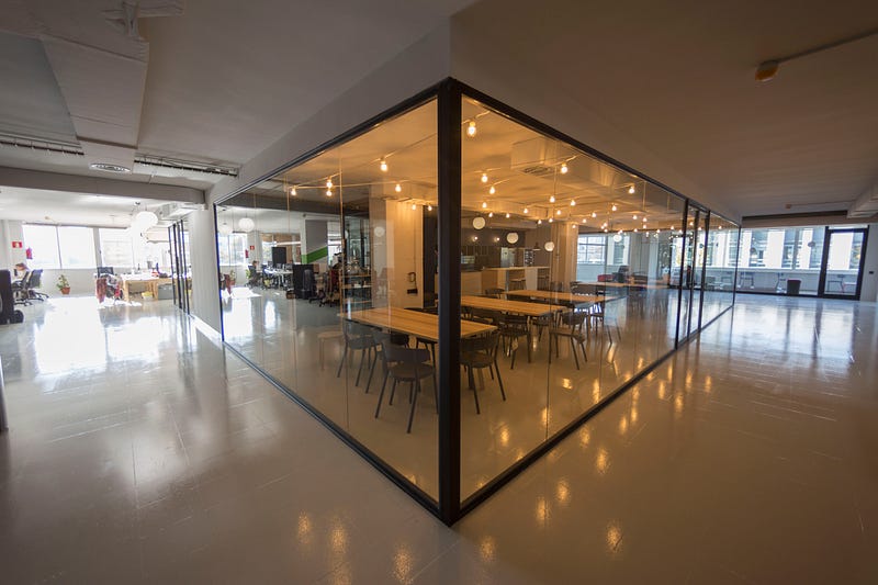
We should start by our own: At Itnig we provide great spaces for tech companies, including high-speed internet, events room, leisure room, terrace, open spaces, chill-out areas and plenty of free beers and coffee! It is also one of the most affordable spaces across the city.
For any more information, feel free to contact: [email protected]
- LaVaca Coworking, Poblesec
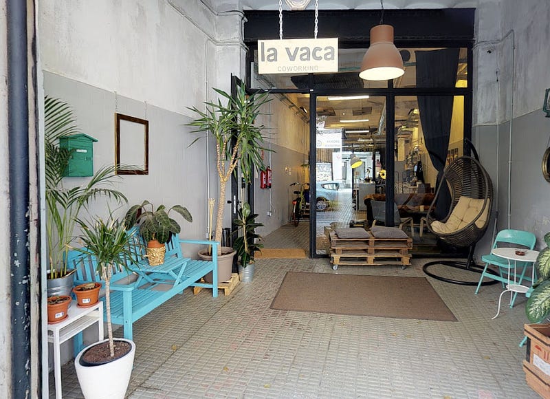
Located in the centre of Poblesec, LaVaca Coworking was transformed from an old dairy shop and is today a coworking space.
Carrer de la Creu dels Molers, 19 08004, Barcelona, Spain
- OneCowork, Plaza Catalunya, Gotico and Port Vell
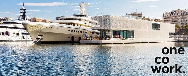
OneCowork offers shared working spaces in Plaça Catalunya, Marina Port Vell and Gottico.
- Cahoot Coworking, San Antoni
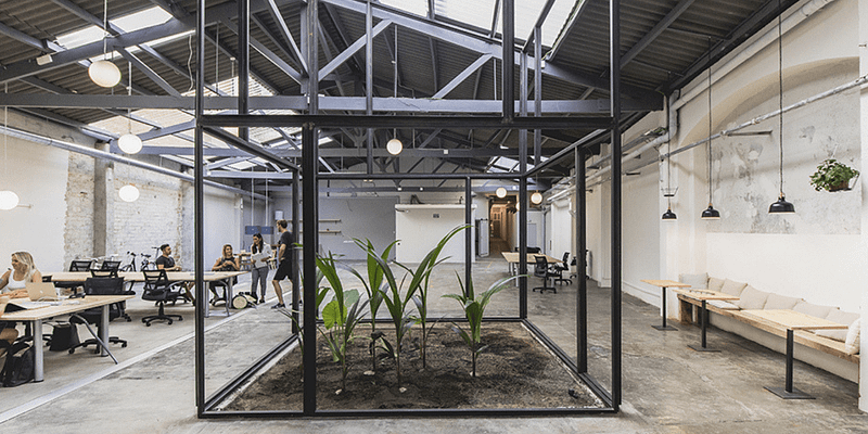
Cahoot, located in San Antoni; about 10 minutes from the city centre is a great place to work from. The Nordic-Scandinavian decor really promotes focus and clarity! If you love working in a hub with plenty of light and creative people: this is the place for you.
Carrer de Floridablanca 92 08003 Barcelona, Spain
- MOB Barcelona, Born, Exiample, San Antoni

As quoted from their website: ‘MOB is a creative hub with three spaces, home to Barcelona’s first community of entrepreneurs and creatives’.
- Carrer de Bailén 11 08010 Barcelona
- Avenida F. Cambó, 17 08003 Barcelona
- Ronda de Sant Pau 47 08015 Barcelona
Espai, Born

Espai born in located about a metro stop away from the beach and the city centre. This well-designed co-working space is located in the centre of Born, 16th-century ‘barrio’ of Barcelona.
- Aticco, Zone Urquinaona
As its name says it all, Aticco is a coworking space located in the centre of the city by the metro of Urquinaona.
Aticco Urquinaona: Ronda Sant Pere, 52
Aticco Verdaguer: carrer de Provença, 339
AticcoMed: Passeig de garcia Faria, 49
Aticco Pallars: Carrer de Pallars, 108
Aticco Hospitalet: Rambla Marina, 456
- Blitz, Gracia
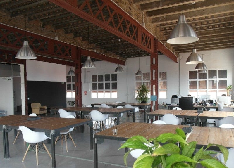
Blitz is a coworking space located in the heart of Gracia and is focused on the development of a growing community of professionals of various industries focused on the synergy and collaboration.
Carrer Ca l’Alegre de Dalt, 55 4to 2a 08024 Barcelona
- Betahaus, Gracia
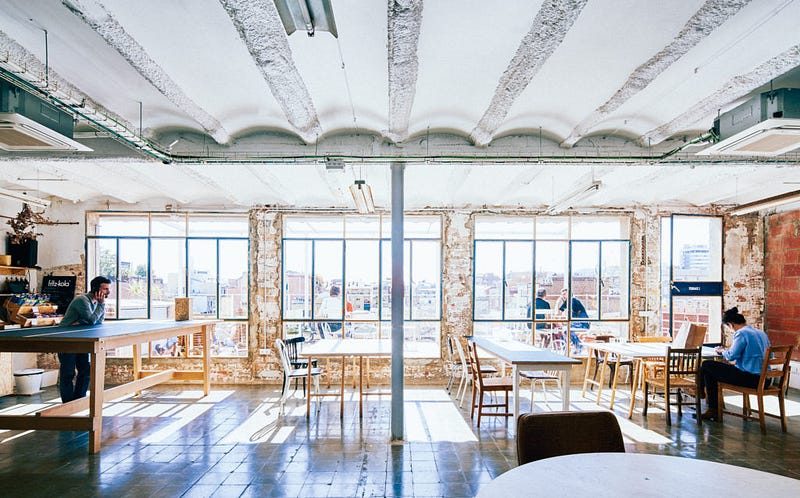
Betahaus is a coworking space for entrepreneurs and creative professionals. offering a functional infrastructure to develop ideas and get your stuff done.
Carrer de Vilafranca, 7
- Kubik, Gracia
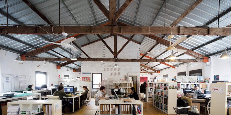
Carrer de Luis Antúnez, 6, 08006 Barcelona
Kubik was the first coworking space ever created in Spain, it was launched 24 years ago and is located in the centre of El Barrio de Gracia.
- WeWork, Poblenou, Eixample, Gracia
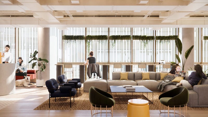
C/Tánger 86 Glories, 08018 Barcelona
Giant worldwide coworking company, not much local personality on it, but surely a comfortable place to work from.
Avinguda Diagonal, 444, 08037 Barcelona
To see more you can take a look at CoworkingSpain and ComunidadCoworking
Talent Development Programs
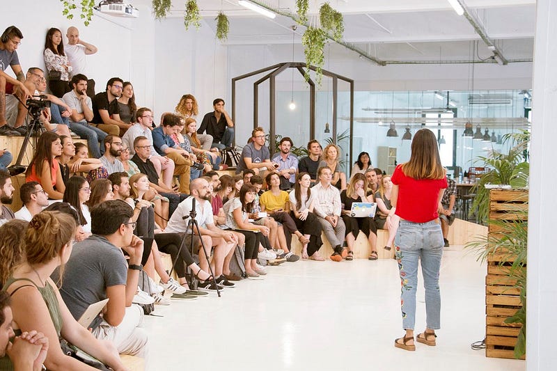
Offering programs in Web Development, UX/UI Design and Data Analytics
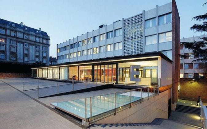
Business School ranking #1 Best MBA for Women in Europe

Business School, #1 World Financial Times Ranking

Business School present in the Financial Times Ranking.

Business School, 300 years old institution with an International presence.

The University of Barcelona is a public university located in the centre of the city, ranking Best University in Spain and 45th best university in the world.
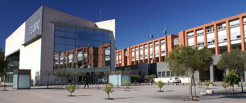
UPC, also referred to as Barcelona Tech is among the World’s top 10 Tech Uni. It’s also among the world’s best universities in civil engineering and architecture.
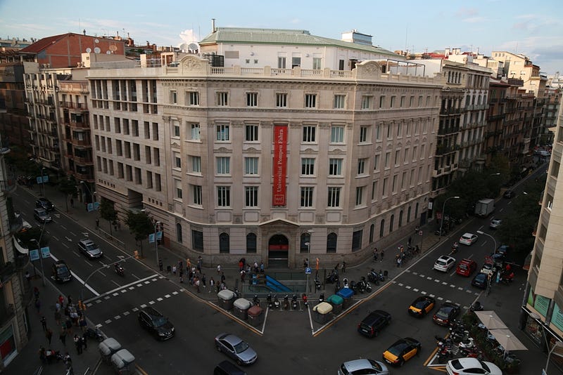
The University of Pompeu Fabra is a public university with two locations: one in El Exiample and another one in Ciutadella. The institution was recognised 1st Spanish University by the Times.
Hackathons and Challenges
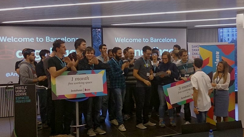
Bringing creators together through virtual competitions, accelerators, incubators, innovation programs and more.
54 intensive hours to give you the insight of the startup life, showing you it’s ups and downs and giving you the possibility to surround yourself by mentors, investors, cofounders and sponsors.

Hackathon focused on the mobility sector on how we will be moving in the future, how we will go around and on its tech. Are you ready for this challenge?
Coding Bootcamps
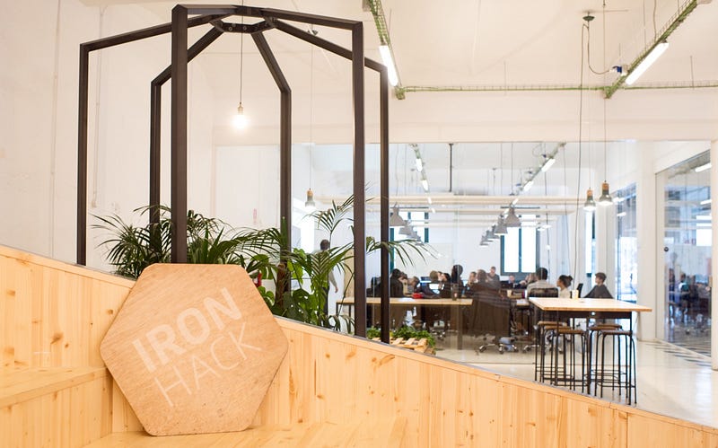
IronHack’s Campus is in Barcelona, offering programs in WebDesign, UX-UI Design and Data Analytics.
Carrer Pamplona, 96 08018 — Barcelona (Spain)
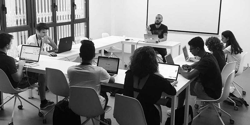
Several weeks Bootcamp offering programs in UX-UI, JavaScripts, Coding, Webdesign and WordPress.
Carrer de Muntaner, 262, 1, 08021 Barcelona
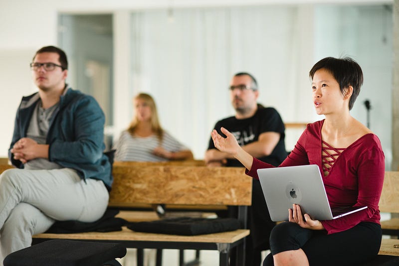
3 Months Full-time program to become Full-Stack Developer, build apps and understand JavaScript
Carrer d’Àvila, 27, 08005 Barcelona
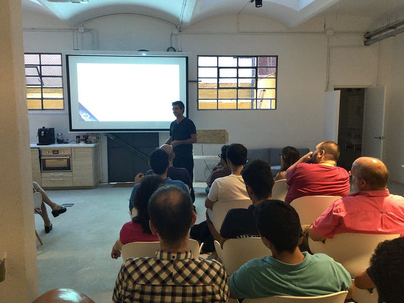
Le Wagon is a 9 Weeks Program where you will learn and develop the skills of a full-stack developer.
Carrer d’en Grassot, 101, 08025 Barcelona
- SkyLabs Coders Academy
SkyLabs offers coding courses where you develop the abilities to create web and mobile applications. You also learn Github, HTML, CSS, Javascript, TDD, ReactJS, NodeJS and MongoDB. Plus, they also help you find a job!
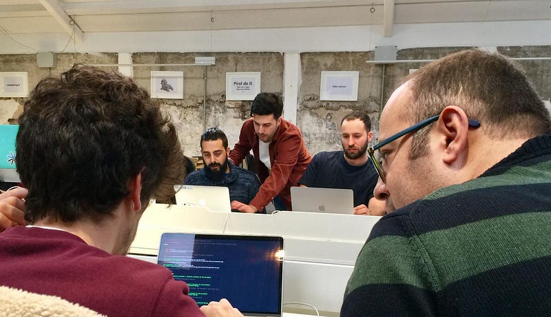
Carrer de Roc Boronat, 35, 08005 Barcelona

The Ubiqum code academy helps its students develop your skills in Web Design, Data Analytics and Machine Learning.
Luxa C/Tánger-Badajoz, Ubiqum Code Academy, WeWork, 08018 Barcelona
Leading sectors in Barcelona
The leading sectors in the city are SMART City Technologies, BioTech/Pharma and Gaming.
Smart City Technologies
SMART CITY TECHNOLOGIES bring info and data technology to the development of public services enhancing the quality of life of its inhabitants. The region of Catalunya is the home to many Smart City Startups, Barcelona is a pioneer to Smart City Technology solutions, with more than 270 Smart City companies in Catalunya, employing an average of 116.000 people, with an impactful total annual revenue of 8.2 billion $.
Barcelona is also the host of the Smart City Expo World Congress.
The major sub-sectors of Smart City present in Catalunya correspond to:
- Mobility, 51 Companies in Catalunya with a turn over of $759 million
- Lighting, 26 Companies in Catalunya with a turn over of $307 million
- Smart Tourism
- Security
- Waste Management
- E-Gov
- Facility Management
- Natural Environment
However, in Catalunya, the most important subsectors correspond to the Smart City Technological Solutions to waste management, mobility and lighting with very successful companies such as WeSmartPark, Datumize and Immfly.
Biotech and Pharma
The Biotech and Pharmaceutical industry participate in the creation and development of new drug treatments, enhancing the quality of life and providing medical cures to health problems. In Catalunya, there is an average of 100 research centres and labs. We also have access to many universities and science tech parks. (Such as PCB and the PRB)
The Biotech and Pharma industry in Catalunya has recently seen the funding of $13.8 million by AELIX THERAPEUTICS, for the development of HIV drugs and biotech solutions.
In 2017, the Life Science sectors in Catalunya were almost reaching $19 Billion; making Catalunya an outstanding leader in the clinical trials.
If you are a digital health startup or company, you should definitely take a look at Barcelona Health Hub as the place to be! You should also take a look at joining the Health20Bcn Community.
Gaming
Ultimately, Gaming ranks third in the leading business sectors of the county. Barcelona is a major place for gaming as Catalunya is the home to more than 120 Gaming Startups, employing about 1600 people. There is a special focus on the gaming industry here, the city hosts the headquarters of Ubisoft, Gameloft, Social Point, King and many more big players.
Here, the average annual revenue for the Gaming Industry corresponds to $256 million. For the game creators, access to talent is outstanding; Barcelona is the home to many designers and creative people.
Catalunya is ranking 5th in Foreign Direct investment in Gaming. In 2015, the Catalan gaming industry represented a turnover of about $257 million, that was highly expected to escalate more than 30% by 2019.
In Catalunya, we also see a fair development of other sectors such as:
- the Green Economy and Sustainability solutions that guide us towards the development of intelligent use of energy and resources.
- Industry 4.0 allowing the development of our current industries by the development of technologies and it’s the incorporation
- Tourism developing solutions towards more eco-friendly solutions that promote responsible management and strategically sustainable tourism.
- Commerce and constant development of the economic growth of services and goods.
Startup Incubators and Accelerators of Barcelona
In Barcelona, there is immediate access to many accelerators and incubators program; helping entrepreneurs reach their goals, surround themselves by the right people and use mentoring to their advantage.
At Itnig, we build our own startups with incredible talent who joins us, but we also invest in other’s ideas and projects and support them as they grow. Entrepreneurs starting their projects and looking for money and support, can apply to our fund.
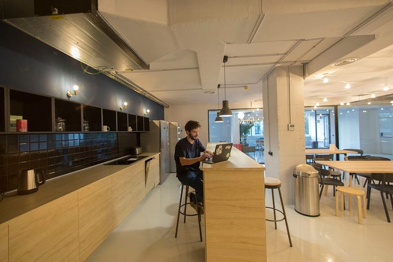
There are other great accelerators and incubators in the city; here is the list of Barcelona’s Startup Accelerators and Incubators:
- Antai Venture Builder
This Venture Builder is focused on E-Commerce, OnDemand, Digital Native Vertical Brands, Marketplace and SAAS projects. They have helped the rise of startups such as Wallapop, Deliberry and BePretty.
1 Edificio Pier01 sector 1A, Plaça de Pau Vila, 08039
- Atipics
Atipics is focused on the development of the projects of young entrepreneurs, helping them develop their ideas, grow an understanding of their market and understand the needs of their target market.
Carrer de Pallars 147, 3ª planta, 08018 Barcelona
Biba Venture Builders are helping companies develop their ideas, find solutions and strategies to enter the market.
Passatge de Gaiolà, 13 08013, Barcelona
- Blockchain.Space
Accelerator focused on the development of disruptive and technological solutions; solving real solutions with the technology of blockchain.
BStartup is a program created by Banca Sabadell promoting entrepreneurship, collaborative innovation and development of solutions.
- BarcelonaTech City
Barcelona Tech City is aiming to make Barcelona one of the most powerful technological hubs. It’s promoting tech projects, helping develop ideas and solutions within the tech industries.
Plaça de Pau Vila, 1 Bloc A, Planta 3, Porta 3A1 08003 Barcelona
- CAEC
Catalunya’s Business Association of Entrepreneurship
Travessera de Gràcia, 274, 08025 Barcelona
Conetor has been working with entrepreneurs for the past 5 years, they are focused on the development of startups from the seed funding stage. The representant of Conector is successful entrepreneurs with a wide portfolio of contact in any industry.
We have interviewed Carlos Blanco, one of the mentors of Conector; for our podcast Startup Inside Stories: take a look here.
Carrer Tuset 10, Ent 4º, 08006 Barcelona
Startup Incubator with offices in Barcelona, Bilbao, Madrid, Malaga and Valencia. Demium helps people put together their ‘dream team’ and develop ideas from scratch in only 3 days.
Carrer d’Àvila, 112, 3b, 08018 Barcelona
Founder Institute is the World’s premier pre-seed accelerator having helped launch over 3,500 companies. It was founded in 2009, by Adeo Ressi and Jonathan Greechan.
GameBCN is an incubation program focused on the gaming industry, offering the necessary mentoring and training to entrepreneurs to help them develop their production pipeline and allow them to be successful in the gaming industry.
Carrer de Concepción Arenal, 165, 08027 Barcelona
Considered the World’s most emerging accelerator; put together by the top accelerators, VCs and global brands. IMPACT has participated in projects such as 8fit, GlampingHub and Situm.
IQS Tech Factory provides advice and support to Tech Ventures and entrepreneurs specialised in the technology industries.
Via Augusta, 390–08017 Barcelona. Spain
LaSalle Technova is one of the most important incubators in Europe focused on innovate technologies.
C/ Sant Joan de La Salle, 42 08022 Barcelona
Napptilus is venture builder formed by a group of business, it has more than 15 years of experience in the technological sectors.
Plaça Pau Vila 1, 2B Pier 01 BCN Tech City
Nuclio is a Venture Builder developing and building startups from business ideas to a real company. For more information about this venture builder and about the founder Carlos Blanco: you can take a look at our podcast.
- Reimagine Food
Connecting entrepreneurs, investors, startups and the existing technologies to reinvent the future of the food industries.
Rambla de Cataluña 61, Principal 1ª 08007 — Barcelona
SeedRocket offers startup a common space where entrepreneurs can blend knowledge, ideas and grow together.
Calle Llacuna 162–164, 08018 Barcelona
Startup accelerator promoting entrepreneurship and the positive social impact
C/ Almogàvers, 165, 3ª planta 08018 Barcelona
- SPIRE BIO VENTURE
Spire Bio Venture is a startup accelerator focused on the development of projects in all areas of the life science startup lifecycle.
- StartupBootcamp
Startup Bootcamp is proposing an intensive 3-months acceleration program in Barcelona focused on the IoT and Data.

The Investment within Barcelona’s Ecosystem
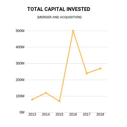
The city of Barcelona is ranked fifth in Europe’s Capital Investment; behind London, Paris, Berlin and Stockholm raising €872 million euros in 2018. As an entrepreneur in Barcelona, you have access to many investors and venture capitals.
Catalunya is Spain’s most attractive region for investment.
Today, Barcelona encompasses more than 65% of Spain’s total start-up investment.
- According to startupheatmap.com, we understand that in 2018, the investment in the city’s startups corresponded to 0.88 Billion Euros, and had a YoY growth of 546%. We can also note that the Business exits in 2018, correspond to 0.59€ Billion making the city rank as the 5th most popular in the world; striking nearly three times more deals than the Spanish capital.
The venture exists-IPOs of the city have timed by 4 in the last four years
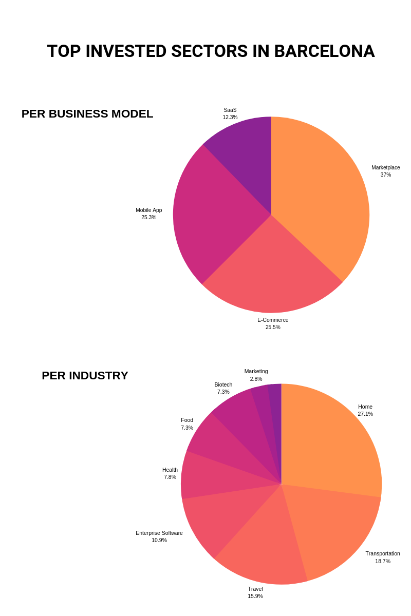
Most Invested Sectors:
- Home with €475 million
- Mobility and Transport with €328 million
- Travel with €279 million
- Enterprises Softwares with €192 million
Most invested business models:
- Marketplace with €875 million
- E-Commerce with €602 million
- Mobile Apps with €597 million
- SAAS with €290 million
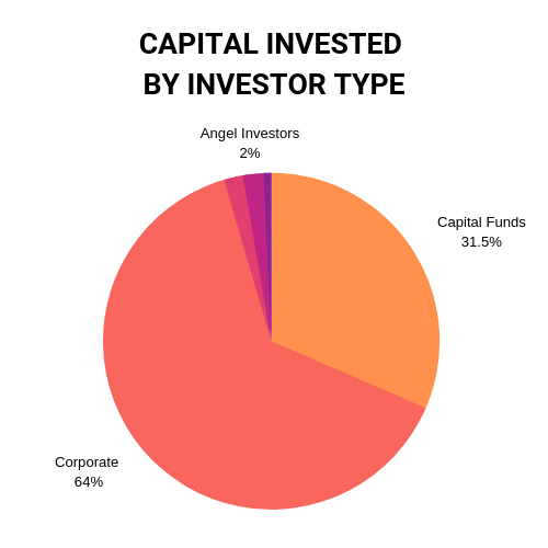
According to the data given by the Mobile World Congress
Seed Funds and Business Angels
Fortunately, the last years Barcelona has developed a mafia of business angels and seed funds that support startups and their teams in their initial steps. Here’s the list:
At Itnig we invest in ambitious, driven and motivated people with great ideas.
We are looking for talented people with vision and commitment, willing to ‘conquer the world’. If you think that you are the right fit, don’t hesitate to check out this page.
Invest anywhere between €30K to €50K in early-stage investment and can bring co-investors to increase this amount. They can also follow up onto 700K per company over the course of a lifetime.
Almogàvers 165 BOX 310 08018 Barcelona
Lanai Partners not investors but a group of partners-entrepreneurs, investing in future winning teams and entrepreneurs. The main partners of Lanai Partners are Jeroen Merchiers, Ruben Ferreiro, Guillermo Llibre and Mar Alarcon. Investing up to €200k per startups in various rounds.
Lanzame Capital is the primer pledge fund in Spain, working with entrepreneurs to help them find investments and helping investors find projects to invest in.
Gran Via de les Corts Catalanes, 594 2º 1º 08007 — Barcelona
Origen Ventures fund invests between 0.2 and 0.5 Million € in the 1st investments and has follow-ups of 0.5 to 2MM€. It’s mostly focused on Technology-driven companies tech-based targeted on KETS.
Meridia Capital is the Spanish leader in terms of alternative fund management with two areas of expertise: Real Estate and Private Equity.
Avenida Diagonal, 640 08017 Barcelona (Spain)
The Collider is boosting digital and tech projects from the best universities and research centres, to help science-based companies face complex industry problems.
Pl. Pau Vila, 1 Sector C 2nd floor 08039 Barcelona Spain
Seed and Click is a private network of international investors focused on the technological startups in all sectors.
Plaça Francesc Macià, nº 8–9, 1º D 08029 Barcelona
Smartech is built on the partnership of 6 professionals with an accumulated experience of more than 50 years in entrepreneurship, VC and Corporate Finance.
Av. Diagonal, 403–2ª 4ª08008 Barcelona
Stepone invests in the first stages of technology startups with high growth potential.
Inveready is one of the leading early-stage venture capital funds in Spain.
C/ Dels Cavallers 50, 08034 Barcelona
List of business angels in Barcelona:
- Albert Armengol
- Albert Domingo
- Albert Ribera
- Alex Rodriguez Bacardit
- Alexis Roig
- Andrés Bou
- Bernat Farrero
- Chris Bouwer
- Dan Kragt
- David Tomas
- David Boronat
- David Jordan
- Didac Lee
- Enric Lluelles
- Elena Gomez del Pozuelo
- Gerard Olivé
- Guillem Serra
- Helena Torras
- Horacio Martos Borja
- Ilya Zayats
- Javier Llorente
- Jesus Monleon
- Juan Margenat
- Jordi Romero
- Malak Saber
- Meritxell Viladomat
- Miguel Vicente
- Nacho Cofré
- Nacho González Barros
- Oriol Vila
- Oriol Blanc
- Pau Ramon
- Pere Mayol
- Perre Valles
- Roger Dobaño
- Sergi Benet
To find specific information about the Business Angels of Barcelona: click here
Venture Capital funds in the city
In Barcelona, you can access various venture funds depending on your industry and your needs. We specifically took the funds who actively invested in the last 15 months, in order to provide you with the most up to date info!
- ABAC CAPITAL
- Active VP
- Athos Capital
- Ariol Capital
- Banco Sabadell Investment Fund
- BigSur Ventures
- Caixa Capital Risk
- Encomenda Smart Capital
- FlintCAPITAL
- Galdana Ventures
- IVC Digital Tech
- NautaCapital
- Nero Ventures
- SI Capital
- Sitka Capital
- Ysios Capital
Business and Tech Events in Barcelona
Barcelona has the grace of allowing the development of professional teams with its social culture and its impressive talent pool.
We all know how hard is to find awesome tech people. In Barcelona, most will gather in the afterwork events in Poblenou 22@ neighbourhood, filled with an interesting mix of tech studios, lots of startups, old looking factories, designer ateliers and hidden antique shops interacting surprisingly well together.
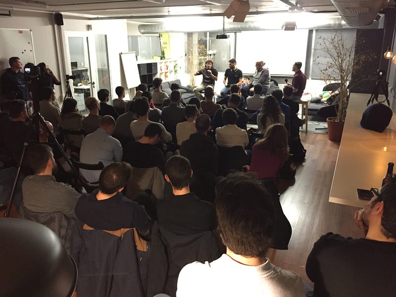
Barcelona is the host of world-class international business events such as the Mobile World Congress (and its startup edition 4YFN) the ISE and the Smart City Expo
These events have a huge positive impact on the city attracting investments, startups and corporations from all around the world. It’s also a source of inspiration and gives entrepreneurs a wider vision of what’s going on around them.
Barcelona’s events push the case of the Catalan’s ecosystem and it’s growth; making it an incredible opportunity and benefits provider for entrepreneurs.
Some great international events of the City
- Startup Grind Conference
- Sonar+D
- Smart City Expo World Congress
- EU Startup Summit
- Mobile World Congress
- 4YFN
- White Bull Summit
- Blockchain European Conference
- BCN Game World
Innovation in Barcelona
According to Business Insider, the Catalan city is ranked 4th in the top tech and innovation hubs in Europe behind London, Berlin, and Paris.
It is the home to Barcelona Tech city, many accelerators and incubators in mobile and tech; such as the StartupBootcamp global startup accelerator and corporate innovator known as the leading accelerator in everything data related. It is also the host of Seed rocket, funding startups in technology and Conector, famous 6 months program in digital tech projects.
Speaking of Barcelona Tech City, it is a private non-profit membership association represented by Miguel Vicente as Chairman and Miguel Marti as CEO. This promising association represents among the Spaniards, the tech and digital ecosystem. It’s shaped by a blend of startups, accelerators, incubators and large companies such as The SEAT Group and VC firms like ANTAI.
The mission of the hub is to position Barcelona as one of the principal International Technological Hubs in the world.
So far, this project represents more than 800 companies, has more than 650 members and covers over 400 fields of activity. It has for objective to promote Barcelona’s tech and innovation attracting international talent and collaborating with other organisations in order to promote growth in the ecosystem. (Find out more)
The overall relevance of the technology and innovation ecosystem in the city’s global outlook is exemplified by the fact that Barcelona became in 2018 the world’s first city to deploy a Science and Technology Diplomacy strategy.
Implemented by SciTech DiploHub, a pioneering nonprofit public-private partnership backed by Barcelona’s leading startups, corporations, universities, research centers, non-profits, and public institutions, the organization is in charge of designing and executing the city’s innovation ecosystem’s international strategy; empowering the global community of talent educated in Barcelona, the Barcelona Alumni network; bringing together diplomatic missions and the local innovation scene to enhance collaborative projects; and delivering policy advice, working as a think tank where the power of technology and scientific expertise is harnessed insupport of evidence-based policy and training the next cohort of global leaders in science and technology diplomacy.
This unique initiative is led by SciTech DiploHub’s CEO, Alexis Roig, a globally-based serial entrepreneur currently serving as the de facto Barcelona’s Ambassador for Science and Technology with the mandate to represent the city’s innovation ecosystem worldwide, thus making Barcelona a more influential player on the global stage.
Build your Network
At Itnig we organize regular events for tech-heads, entrepreneurs and startups to try to give tools and resources for dooers.
Attending our events, you can build your network and surround yourself with like-minded people. Who knows, you might meet your ideal co-founder?
To find out more, take a look at our meetup group
Here is a list of other business networks and meetups groups in the city:
- Lean Startup Circle
- EWMD BARCELONA
- Data Beers Barcelona
- MOB
- Entrepreneurs, Freelancers and Marketers: Barcelona
- GuiriBusiness Network
- The Business Lunch Barcelona
- Wijus Barcelona
- French Tech Barcelona
- First Tuesday
- El Iniciador Barcelona
- B Network
- BizBarcelona
- Barcelona Women’s Network
- BNI
- ESADE BUSINESS NETWORK
- Telanto
- Barcelona’s International Business Club
- Alumni Club EADA
- IESE Network
- EBN
- Association Espanola de los Business Angels
- Barcelona Business Association