Why you should aim UX/UI design at zombies

I’m faced with a design challenge everyday. Sweet! I like it. It’s fun and rewarding to find a solution, if that’s your thing. Like working on a puzzle: finding all the pieces, recognizing what’s their right position, joining them one by one, and finalizing with a composition that only makes sense when everything is together.

That being said, the pieces of the puzzle don’t have a clear shape or color, and a lot is left to analysis, and interpretation. And you don’t even have a reference of how the puzzle is supposed to look like.

Probably is not like putting a puzzle together at all. Whatever. Never mind.
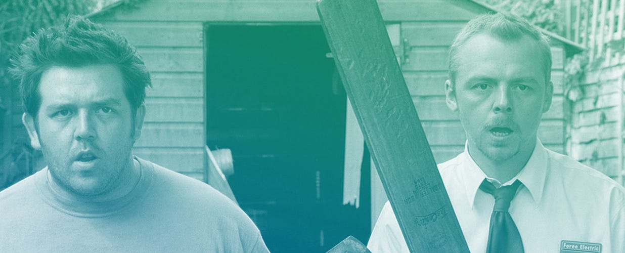
Zie zombies

And who is the target? Who is going to end up looking at that puzzle — or whatever that is — that a UXUI Designer put together? You are. We are. The idle minded. Because that’s what we — the users — are in the end. Our brains are too busy thinking on what we’re going to have for dinner, where, with who, or if we will have take away on our own again. So when we grab the phone, open the browser, grab the TV remote, we’re not actively thinking. Content. That’s what we want.

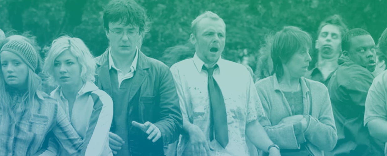
When I first heard about this, the fact that users don’t think, I felt disappointed on human intelligence. But after all, one of the must-read books for product designers is called “Don’t make me think”. Like it or not. We are contributing to feed a whole generation of Zombies. Users are zombies.

If you think about it, makes a lot of sense.

They move in big groups, without a clear objective, relying on automatisms and muscular memory, reacting slowly, and paying little or no attention to their surroundings.

Full attention, not necessary

Now, I am not saying that people are zombies. My point is that users are multitasking most of the time they spend in front of their devices. We eat sandwiches, drink coffee, walk around the city, talk to our friends, and listen to music. We even dare to think of more important stuff! Because using an app shouldn’t be cumbersome. After all it’s just a tool. The meanings to an end. And although some tools are far more complicated than others, once we learn to use them we don’t actively read any buttons or labels anymore. We knowwhere everything is. And when something changes we hate it, because it makes us think and reroute our wirings.

When I started designing websites, which would lead to designing software and interfaces, nobody told me psychology would play such a big role. Yet, we don’t get to play with full functioning brains most of the time, we have to make what we can out of 20% of the user’s attention — Yes, I made that number up.

Your users won’t be reading half of the labels, nor what the buttons say. They will type in what they consider that should be typed in, wherever they consider its supposed to be. And they will click that big chunk of color that looks like a button, and will always click and tap on the image, not the text. To make that easy, the design has to avoid possible distractions.

In order to make a user interface work, we have to strip it out of all the unnecessary. Here’s an example.

Keeping it simple, visually

A while ago, I work on a project at Asana. We called it Typography Update. During the redesign many hands touched the interface, and many engineers worked on the CSS. The result was great. But part of the collateral damage of having so many moving parts were little mismatches on font sizes, colors, and spacing.

So I went on and reduced the number of styles, fixed inconsistencies, and adjusted the margins. I reduced and standardize the body size, the paragraphs, and their line-height. Headings had the same exact style now, in a couple of different sizes for hierarchy. Project names became tokens almost everywhere. Margins became consistent around the objects, and relative to object their size. And different shades of gray for copy were reduced to only two, based on the contrast ratio with the background.

When I showed the first results to the product manager she couldn’t see the actual changes. She asked “How did you do that? You didn’t change anything and it looks way better!”. The multiple styles and little inconsistencies had been adding noise and clutter. Imperceptible. Little by little. Too many instruments going for a solo at the same time. We were making the brain work overtime, and forcing it to think. Not a lot. But more than what was necessary.

The voices in our heads

Why was this design more effective and harmonious?

Each different style is a new voice you add to the chorus that is the interface. Restricting the number of those will make things easier to process for the user, since they won’t have to register yet another voice in their head. A bunch of small disruptions will cause havoc in their visual field. But restrict it too much, and all the voices will be the same.

My advice then? When adding styles, make them dramatically different. Go from 10 to 14, from blue to black, from regular to bold. It either is really different, or it’s the same. Because zombies can tell a human from a deer apart. But all human are the same to them: just food.

We are idle minded, our list of priorities is to get what we want, not to understand how we are getting it. We are — and want to keep being — idle minded.

So when building a tool, design something that a zombie could use. That is good product design.

UX/UI and parties

I usually start by saying that I’ve been a designer for the last 15 years, UI designer. “What’s UI?” I get that question a lot, can’t help but smile.

“User Interface,” I respond, trying to answer the question in a few words, “is the visual part of an app. You see, the engineers will write the code, but most people can’t read and understand the code, so the user interface displays all that information in a way anyone can understand. Or at least that’s what good UI does, or tries to do.”

We say app, although UI extends to the OS itself, and nowadays to anything with a screen. We say anyone, but what we really mean is anyone with a certain background — which might be really broad or really specific. We say user interface, when we actually mean graphical user interface; we lost the graphical in the rush of our daily lives.

“So you make apps look nice?” It’s pleasant when people are interested in what you do.

UI is entangled with UX, user experience. Which is how people interact with a tool, the feedback they receive, and the mental model: the way the human thinks the machine operates, to name a few. UI is what you see, UX is everything that happens around it. The interface must be clear and beautiful, the experience direct and pleasant.


Through the years I’ve come to realize that I was always meant to do this for a living. Or perhaps I’m so deep in this shit that it has changed who I am. I love visual arts, I enjoy enigmas and puzzles, and I strive to be as rational and objective as possible.

You’ll recognize a UX/UI designer because when faced with a complication in real life, they will stop to think about it for a second, ask a clarifying question about the usage, and then proceed to recommend something that could solve the problem. The solutions might include getting rid of something that’s not useful, changing the location of certain things, or even wondering if the complication could be completely replaced with a simpler, more adequate thing.

I was at a house party once — I’ve been to more parties, but they’re not as relevant.

The hosts had an ample living room, but all the guests were hanging out in the kitchen (happens at all parties). So the room with the music was empty, and the kitchen was crowded, making it hard get a drink. They had an L-shaped couch in the middle of the living room, dividing the space in two, which is useful for watching movies and creating two spaces in one room. I mentioned to Theo that if we moved the couch, it would create more space, allowing people to stand there — and even have room to dance. We moved it 90 degrees and pushed it against the corner — a change in the user interface. The amount of seating didn’t change, so we added a feature without losing another one in the process. Great!

Then I turned my attention to the dinner table, that was still blocking part of the living room. I should’ve suggested beer pong at the time — let’s call that v2 — but instead I suggested the same operation: turn it 90 degrees and put it against the wall. We also brought the spirits from the kitchen counter to that table, so those drinks were easier to access, freeing up the kitchen, and allowing beers to remain cold and accessible in the fridge. We changed the way you grab a drink (the user experience, that is), divided the most common actions (beers and cocktails) into two main categories with two different flows.

After this, the party was the same: the same conversations, same music, and same people. The contents remained unchanged, but it was more user friendly.


A party, an appa pedestrian crossing… In the startup world we might consider user interfaces just a part of the many in software, but simplifying and adjusting to our needs the way we interact with tools — and other people — , can always be positive. Next time you’re faced with a complication think:Do I need it? Is it the best solution? Can it be simplified?

A staple can’t get simpler, but you might not need it at all: a paper clip does a similar function and it’s reusable. Or maybe you didn’t even need to print that at all. And as I finish my drink and this paragraph, I wonder if I’ve explained what UX/UI design is effectively. What do you think?

Undressing a CTO and how to become one

Do you want to become a Chief Technology Officer, or are you just curious about the role?

If you want your keyboard to remain your closest friend, you can stop reading right here, being a CTO is much more than just being a talented developer. But if you want to get some insights from three experienced Barcelona-based CTOs, please continue reading.

Investing time in your team is the most important task, even more important than focusing on your product.

Right place at the right time

Roger Campos from Camaloon (to the left) says that personal experience is much more important than how many years you have worked in a company.

In the startup world not all decisions within the company are carefully planned and executed according to the planned strategy.

Pau Ramon Revilla, former CTO of Redbooth, and currently founder at Factorial felt he was at the right place at the right time when stepped up as CTO for the first time.

I started at Redbooth, living on the founders sofa in San Francisco, coding for a roof over my head, so I wasn’t a very expensive developer. But as I went back to Barcelona, the former CTO and the tech lead left, and I was asked to be the new CTO.

For others it’s more of a transitioning after starting a company from scratch.

Both Albert Bellonch at Quipu and Roger Campos at Camaloon founded their startups, and gradually grew into the CTO role as their companies grew. Roger never really set out to become head of tech at Camaloon:

It was never a goal of mine to become a CTO, but you take on responsibility and do your best to grow a great team.

The biggest challenge — new developers

A huge challenge for most CTOs these days is finding talented developers in a highly competitive job market.

CTO Pau Ramon Revilla and Roger Campos says personal motivation is key when hiring new developers.

But what kind of developers are most tech leaders looking for?

They all agree that the most important aspect when hiring, is personal motivation, and if the person is willing to go deep in all kinds of challenges he or she faces.

Experience is important, but having worked for many years, is not necessarily the only metric that is valued, say Roger:

If a developer has worked in five different jobs the last years, doing the exact same task, to me he is less experienced than a younger developer, that has worked on many personal projects and faced complex challenges.

Pau gives junior developers two tips:

The startup world may be too harsh for many junior developers. To get the right kind of experience I would advice to contribute a lot in open source, and maybe take a job in a big corporation the first years.

https://upscri.be/285782-2

Invest in people

People have different skills and methods on how to lead a technical team, but the three CTOs agree that people is the most important focus for them in their work. Pau explains:

Depending on the company, most of the time the development team will be the most valuable asset, sometimes even more than the product itself.

All the CTO’s agree, and Roger says:

My biggest task and most important mission is to talk with people. Talk with my team, with the rest of the company and external people, that’s most of my job.

I keep coding to keep my sanity

Albert Bellonch (to the left) is still coding every day at Quipu, but will soon have to stop to code on a daily basis because his team is growing a lot.

It’s no secret that time spent coding decreases a lot when you move over to the role of being a leader.

Albert is currently leading a 4–5 development team at Quipu. He’s happy he’s still able to code every day:

I still code on a daily basis, and I’ve been able to create some cool new features for Quipu, but as my team grows by the months, I will soon stop coding every day.

Soft skills

A developer that has the aspiration of becoming a CTO should have a lot of experience, but there’s also other skills that are vital, says Pau:

Focus on the soft skills, you need to be able to reach a consensus with people, not only focus on your own opinions.

All the CTOs agree that you don’t need to be the best developer in the company to lead the development team, but there are some skills that are good to know these days, according to Roger.

It’s hard to point to one kind of technology, because everything depends on what kind of project you’re working on, but Javascript is probably the safest bet for a developer today.

(If you want more insights, check out the video at the top!)

……..

This post was written by Sindre Hopland and the video was edited by Masumi Mutsuda — the itnig media team.

How EDpuzzle Went Straight To Silicon Valley Without A Single Line Of Code

Barcelona startup EDpuzzle went through Y-combinator’s Edtech program imagine K12.

A lot of Spanish entrepreneurs go to the US to expand their markets. It’s normal, it’s the right thing to do for most companies. But usually you take with you a portfolio of achievements and milestones from the country you started up in.

Not EDpuzzle, according to co-founder and CTO Santi Herrero.

We started from scratch at ImagineK12, now part of Y Combinator where big companies like Dropbox and Airbnb were born. We applied with an idea, but without any line of code at all. The idea we had when we moved to San Francisco was that we needed to build a tool that allowed teachers to make any video their lesson.

The Barcelona startup combines simple video-editing tools with analytics so that a teacher can take a video and make it personal for their classrooms.

The teachers can take already existing videos from Youtube, Khan Academy, Crash Course, etc. or upload your own, and then enable self-paced learning with interactive lessons, adding their voice and questions along the video.

Not global from day one

Experts often say that you need to have a global mindset from the first day, no matter where you start your venture.

And even though EDpuzzle hoped their product could reach a global audience, and today is used in 150 countries by 6 million users, the first focus was very local, says Herrero.

Our initial approach was to connect with 10 very interested and energetic teachers to learn from them as much as possible. This way we would get a lot of very vital information for the development of the product. Those teachers ultimately became some of our biggest evangelists.

After three months and demo day at Y-combinator, EDpuzzle had several interested investors in the US, so not long after returning to Barcelona, a part of the team went back to start raising a seed round which resulted in $800.000.

The CTO and co-founder thinks their very local focus helped them create a better global product, compared to if they went straight for the masses.

To really learn from your users you need to be very close to them, you can’t retract everything from analytics etc. After we got the validation we needed from several teachers, we started driving around in the US to all the education events we could find, and talk to as many teachers as possible. That’s how we grew.

Barcelona + San Fransisco

Even though parts of EDpuzzle’s team have been in San Fransisco from day one, the development of the product has been done from Barcelona.

Our competitive advantage is that we can hire great developers from our network in Barcelona, with a lower cost than in San Fransisco, and create a great product from here.

Says CTO Herrero who is hiring people in all kinds of positions after the company closed $3 million in their series A this August.

It makes a lot of sense for us to divide the business between Spain and the US, because our biggest market is in the states. I can’t say that this is the right thing to do for everyone, but the US market is easier to enter and people are open to new solutions, especially in the Edtech sector.

Keeping it simple

From the beginning EDpuzzle valued keeping their product as simple as possible.

Both EDpuzzle’s landing page and their product reflect their value of keeping what they do as simple as possible.

Both their product and their landing page reflect this value of simpleness.

They said it’s about knowing their audience, and that the last thing a busy teacher needs, is spending time on learning a new complicated tool.

In a matter of days they’ll release their android app, so students can consume their teachers’ videos no matter if they have a computer at home, or not.

We are now in 1/4 schools in the US, but our goal is to be in all of them.

………………………

This post was written by Sindre Hopland, media manager at itnig.

Why Smart Cities Depend On Smart Parking

Smart parking is one of the easiest ways humans can make cities more sustainable.

The term smart city has become quite popular the last years. The expression indicates an urban area that, thanks to the use of advanced technology, isable to deal with a wide range of the citizen problems and needs in an innovative way. The purpose is to improve radically the quality of life, opportunity, health, social and economic development of the city.

However, a smart city is more than a digital or technologically advanced place. According to a group of researchers of the Vienna University of Technologies, the essence of a smart city is defined by six parameters: Smart Economy, Smart Mobility, Smart Environment, Smart People, Smart Living and Smart Governance.

Parking smart

One of the main problems for all big cities, and that touch on several of the six “smart parameters” are the lack of parking lots. Often, the public car parks built by the authorities, are not able to comply with the real needs of a city, defacing the landscape, with insufficient functional results.

That’s why different ventures have been launched the last years to reduce traffic and pollution in cities and make public transportation cheaper. For example, booking a parking spot online, allows you to avoid unnecessary queues, which again causes less pollution.

Parking is a central point of a Smart City, because a smart city informs people about available staging points in real time and enables them to build the best accessibility path with buses, trams, bikes or scooters, pedestrian areas, car sharing, taxis.

And to make the parking experience both more seamless and smarter, it’s also vital to allow people to pay for the parking service through their connected devices.

Even though the government or local authorities are the biggest owner of parking spots in most cities, they lack the flexibility to make concrete choices, investments in technology (for example for geo-referencing all the road staging points and therefore the possibility of informing on availability), but also directing and integration capacities whenever they are needed. This needs to be handled by a private company to work properly.

Not convinced?

That smart parking saves people a lot of time, instead of looking for a free parking spot, is alone extremely beneficial for society, making it much more efficient.

But if you’re not convinced by the arguments presented already, there are countless others showing how beneficial smart parking actually is for the cities of the future:

  • In the long run it would be possible to offer incentives to motorists for parking in low-demand areas to reduce congestion in areas with a lot of activity.
  • Set higher prices on blocks with low turnover and reduce prices in nearby areas with little or no parking activity.
  • Increase parking pricing during peak hours of the day and reduce it during off-peak hours to encourage drivers to run errands within off-peak hours.
  • Smart parking lets drivers reduce stress (according to a 2015 study)

50.000 cars

Parkimeter, a Barcelona grown startup, have since 2013 parked over 50.000 cars, becoming a leader in the booking market for parkings in Barcelona and Spain.

“How parking has been changed through technology, is similar to how the travel sector was disrupted 15 years ago,” explains co-founder of Parkimeter Jordi Badal.

There is hundred of choices for people choosing to park smart in Barcelona.

Our app allows users (local private, professionals and tourists) to find available parking spots, to choose (and pay for) the most convenient parking spot for them and determine the shortest route to get there. In other words, it’s a way to connect users with parking spaces and payment services thanks to modern mobile technology.

Climate changes, a fast growing urban population, limited energy and water resources, economic and technological changes are just some of the challenges cities have faced the last decades. Smarter parking solutions will not solve all these issues, but it’s an easy way to start, and a way all of us can contribute.

After all, the goal of smart cities are to address these challenges, big and small, and exploit the opportunities offered by these changes, and try to create new projects and services to improve quality of life, respecting the environment and future generations.

………………………….

This post was written by Braggion Martina at itnig startup Parkimeter.